
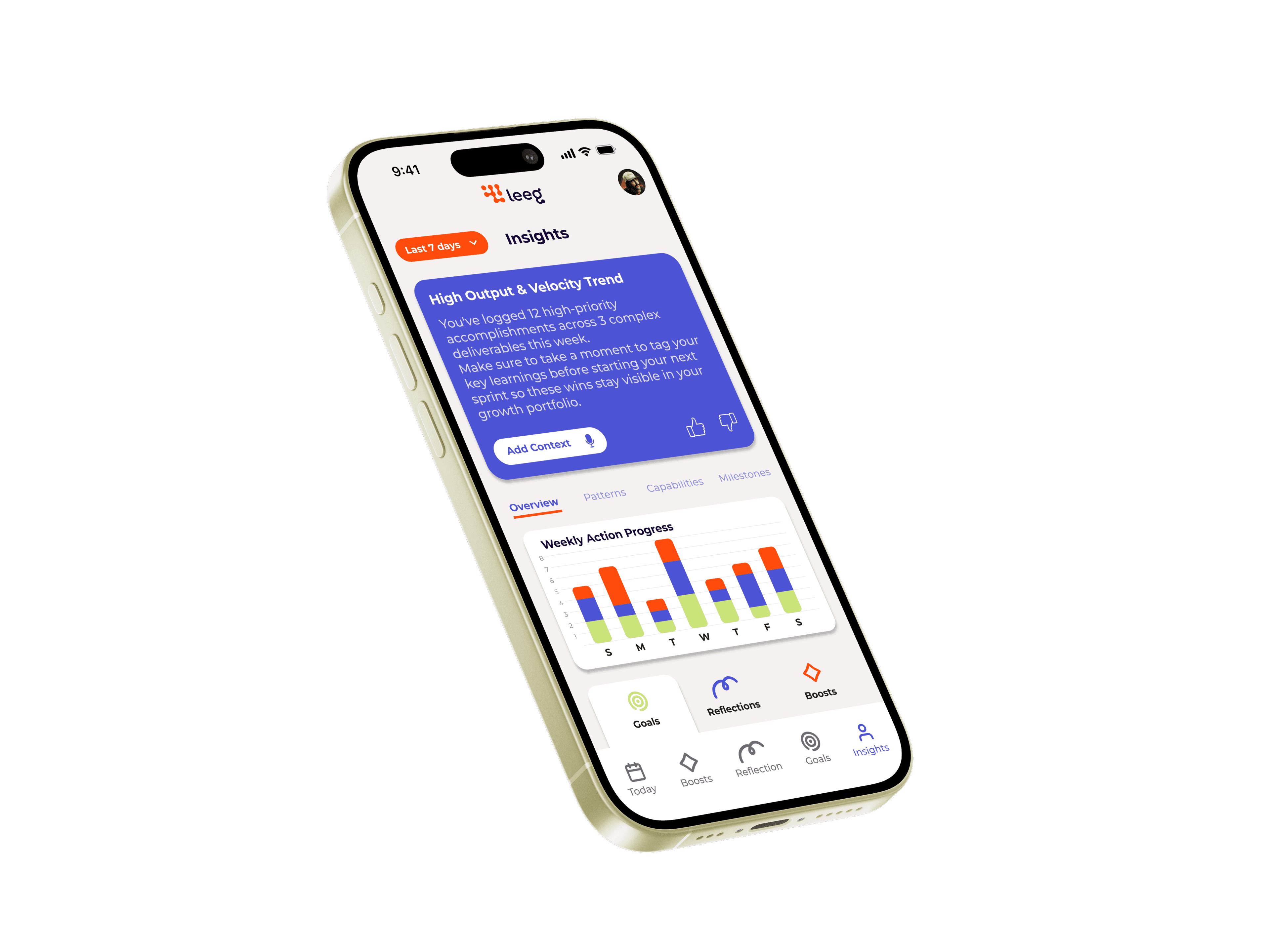
Leeg
Transformed complex stakeholder requirements into structured, gamified career progression dashboards using data-backed user research.
OVERVIEW
Leeg is an AI-driven career companion designed to help professionals track performance, showcase achievements, and plan continuous career growth.
PROBLEM
Traditional resumes and LinkedIn profiles are updated reactively (usually only when looking for a job), leading to forgotten accomplishments, metrics, and milestones.
CHALLENGE
Balancing UX integrity with stakeholder priorities, which favored introducing new feature screens over restructuring and resolving core usability issues within the existing architecture.
PROBLEM & CHALLENGES
USER PROBLEM
Through our user interviews, we uncovered a critical point of friction: using the app felt rigid and tedious—almost like doing homework. User engagement was dropping because the experience lacked dynamism, daily motivation, and flow. Users needed fixes for existing usability issues before adding any extra noise to the interface.
STAKEHOLDER CHALLENGE
This is where the project got interesting. While our research data shouted for us to optimize the current experience and solve engagement issues, business stakeholders were eager to introduce two brand-new screens (Insights & Career Profile) without fully considering the interview findings.
We faced a classic UX dilemma:
How do we meet business requirements without ignoring the voice of the user?
SOLUTION
BRIDGING THE GAP & ADAPTING THE SCOPE
As a team, we realized this wasn’t about picking a side, but rather aligning both visions into a single cohesive strategy:
REFRAMING NEW FEATURES
Instead of building the new screens as heavy, isolated additions, we turned Insights and Career Profile into the exact vehicle to solve the engagement problems.
DESIGNING DYNAMISM & GAMIFICATION
We crafted the new flows using clear data visualization, motivating micro-interactions, and visual progression. This completely removed the "homework" feel and replaced it with an intuitive space users actually enjoyed exploring.
SMART SCOPE MANAGEMENT
We prioritized essential components for launch and negotiated an information architecture with stakeholders that seamlessly integrated the new features while solving the core friction points.
DISCOVERY & RESEARCH
Research Objectives & Methods: Qualitative user interviews, feedback synthesis, and market/competitor analysis.
CORE DIAGNOSIS
Flat visual hierarchy forced users to read dense, competing text blocks rather than taking immediate action.
CRITICAL FRICTION & DATA INCONSISTENCIES
Redundant Modules
The streak counter was duplicated identically on both the Home and Profile screens without adding new context.
Conflicting Metrics
Home reported 4 fading skills while Insights reported 3 fading areas, creating data mismatches that eroded user trust.
Home and Profile stacked up to 7 distinct visual formats in a single scroll, creating "dashboard fatigue" and making the app feel like a passive data dump.
COMPARATIVE BENCHMARK
Top daily-retention apps avoid walls of raw numbers on launch; instead, they anchor the experience around one impossible-to-miss focal point (e.g., Duolingo's lesson path or Apple's activity rings).
INTERVIEWS & FRICTION POINTS
5 Participants: 3 active Leeg users, 2 non-users.
MANUAL DATA ENTRY
Typing skills by hand is the #1 dealbreaker; automated CV/resume uploads are needed.
LACK OF DIRECTION
Too many competing choices create confusion—users want a guided, structured path over a "choose your own adventure."
MISSING HABIT LOOP
The app causes burnout rather than building a sustainable, dopamine-driven habit loop that encourages users to return.
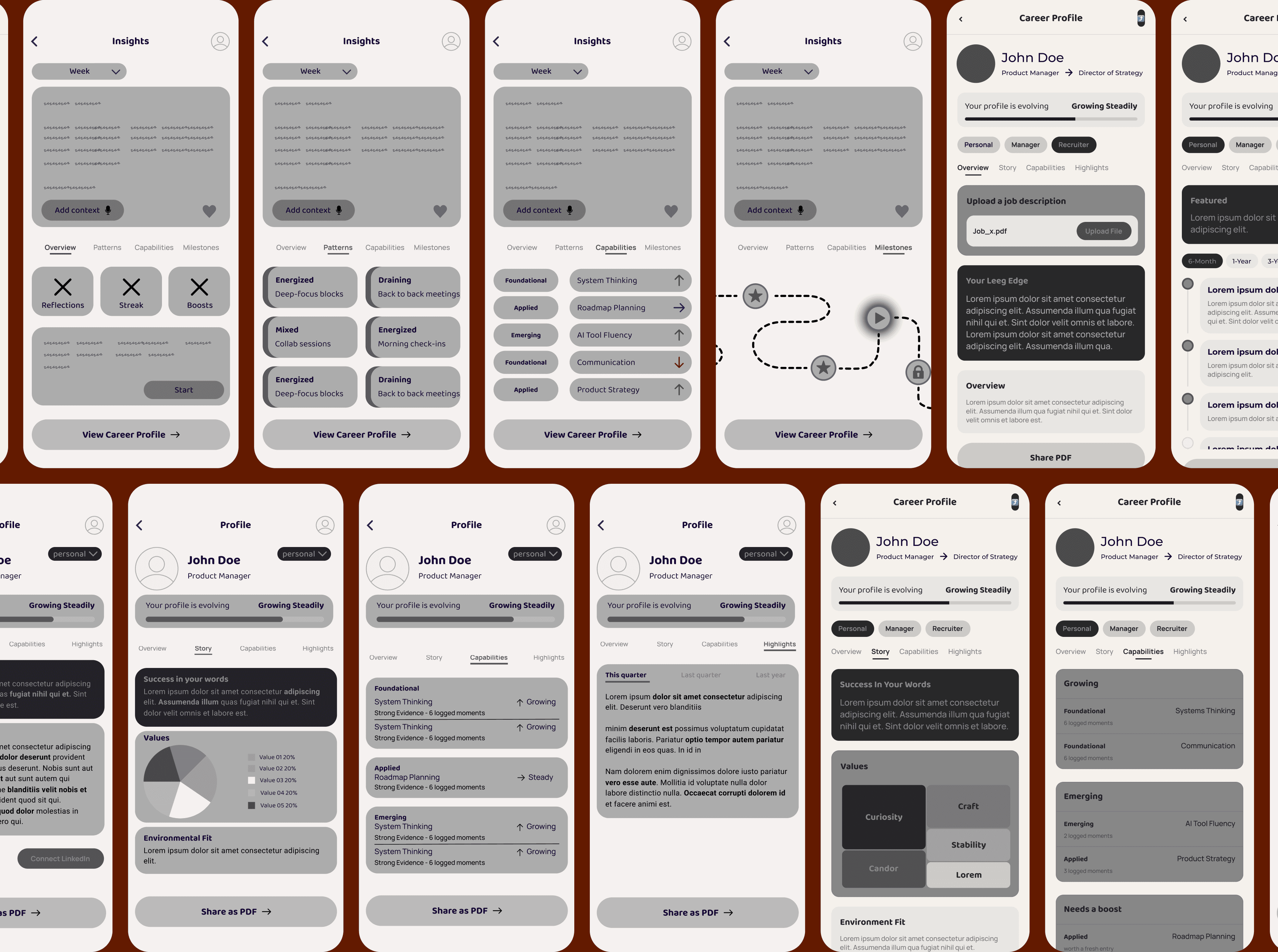
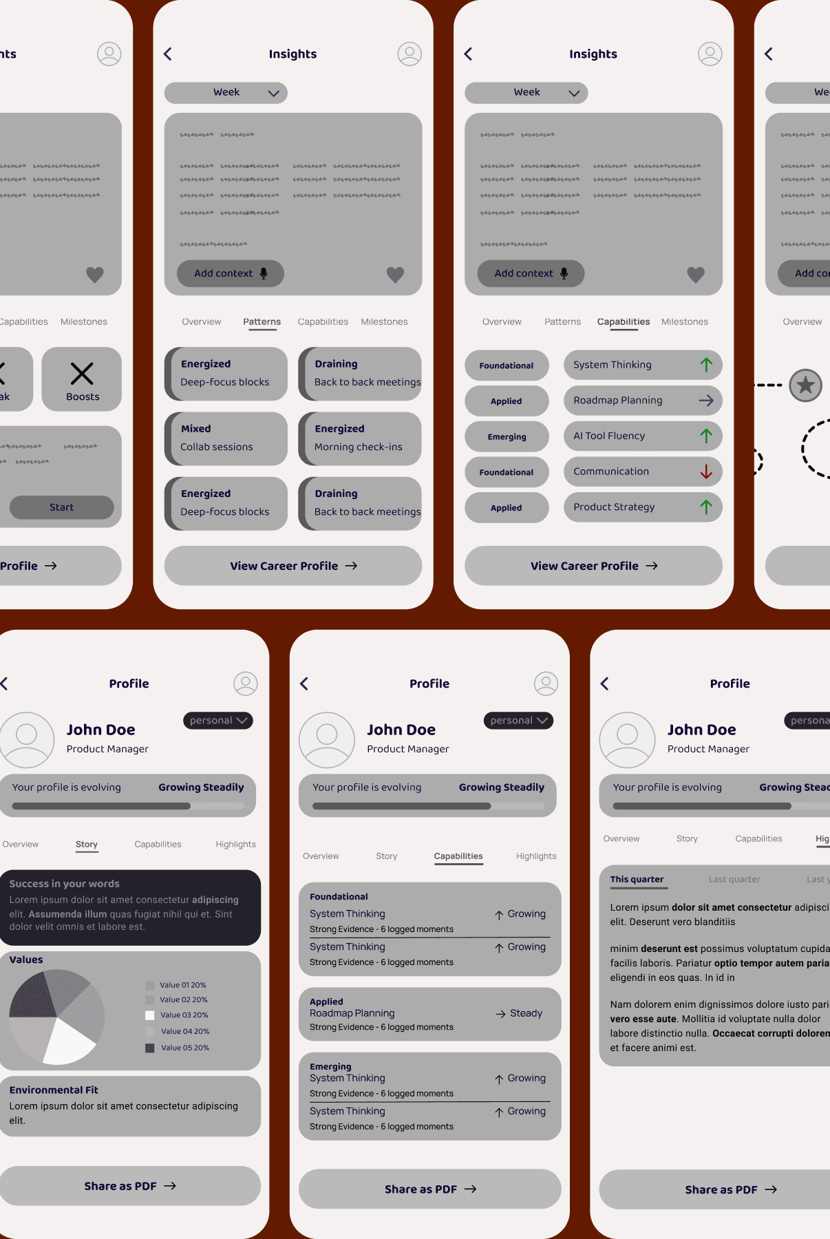
LOW-FIDELITY WIREFRAMES
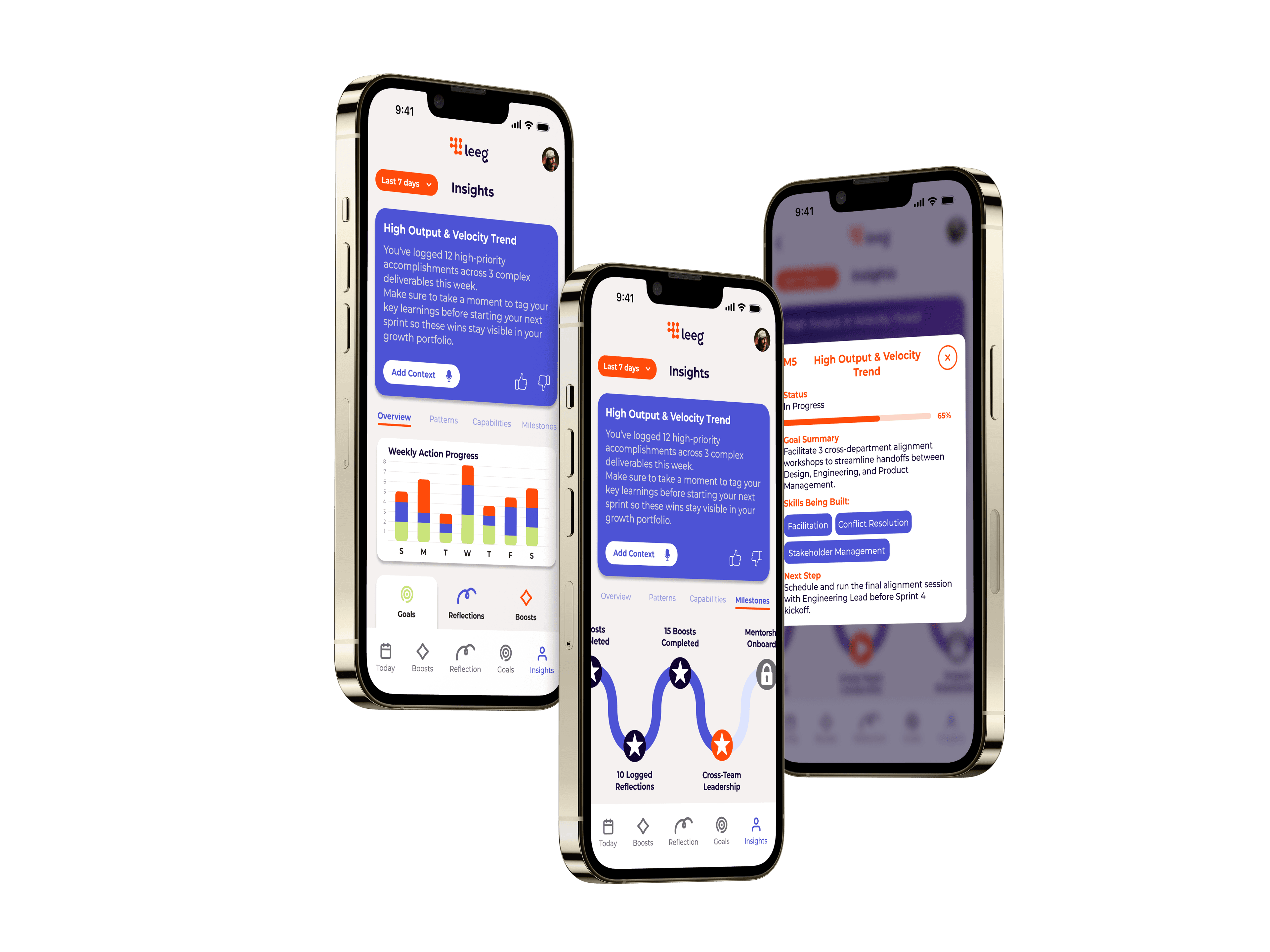
FINAL DESIGN
INSIGHT
MILESTONES
MILESTONE
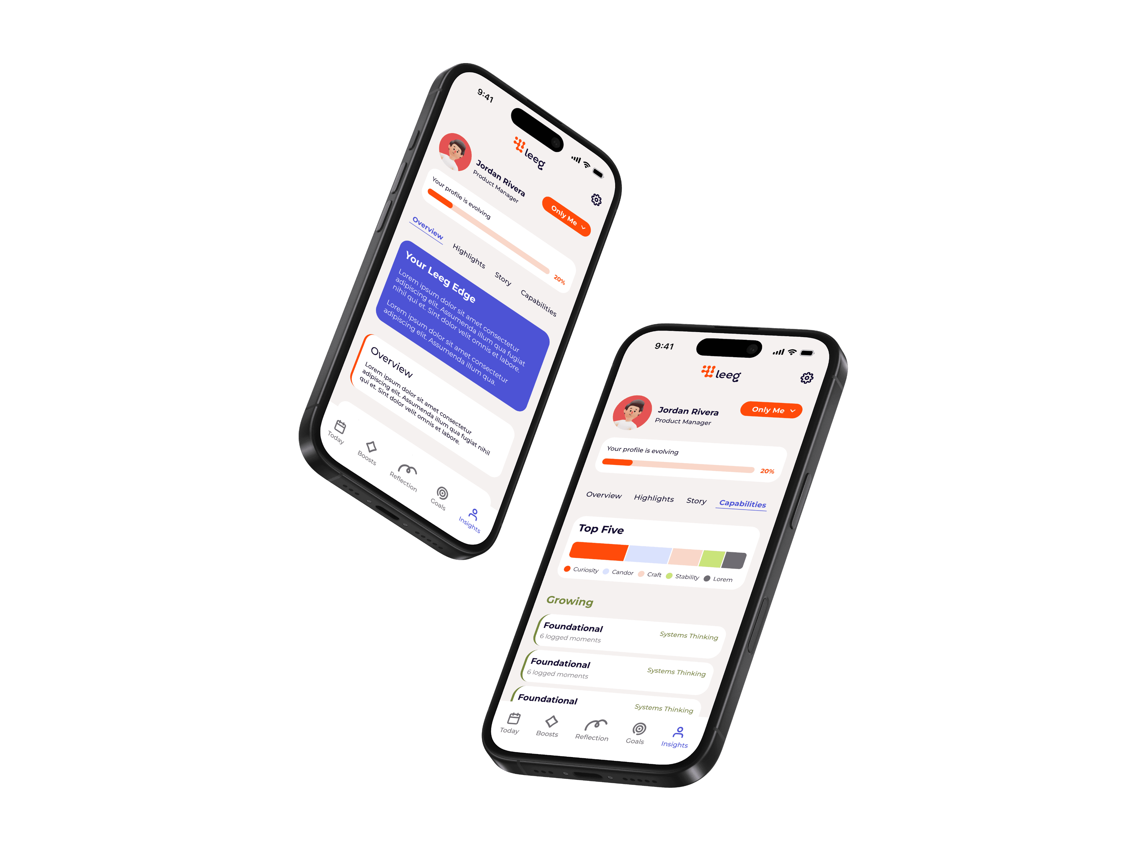
CAREER PROFILE
CAPABILITIES
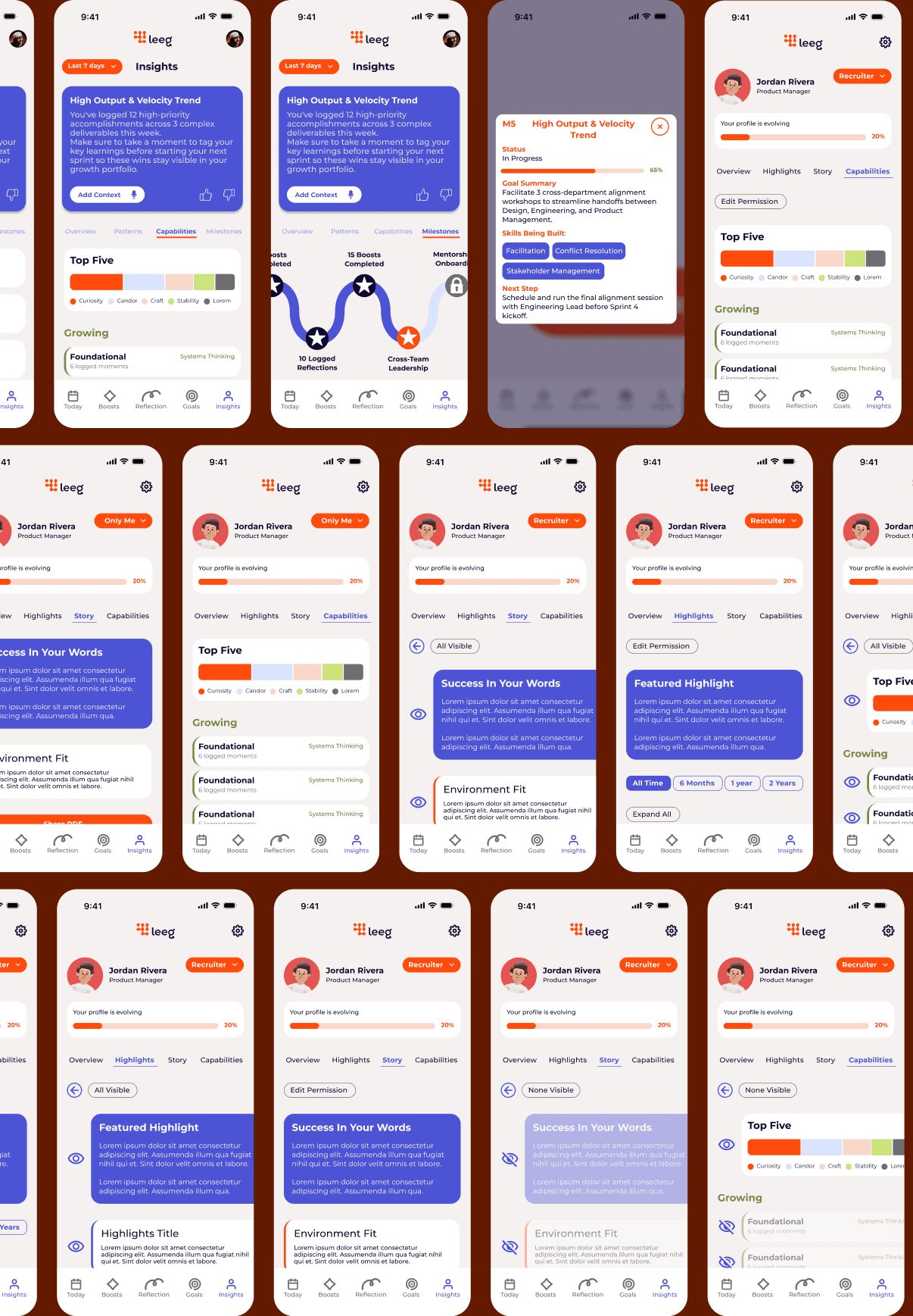
Single Focal Story Card
Replaced static metric grids with one high-priority weekly insight to reduce cognitive fatigue.
Microhabit Mechanics
Introduced bite-sized progress nodes and dopamine-driven completion triggers to build a daily returning loop.
Unified Metrics Engine
Synced decay counters and skill scores directly with the Home screen to maintain data consistency and trust.
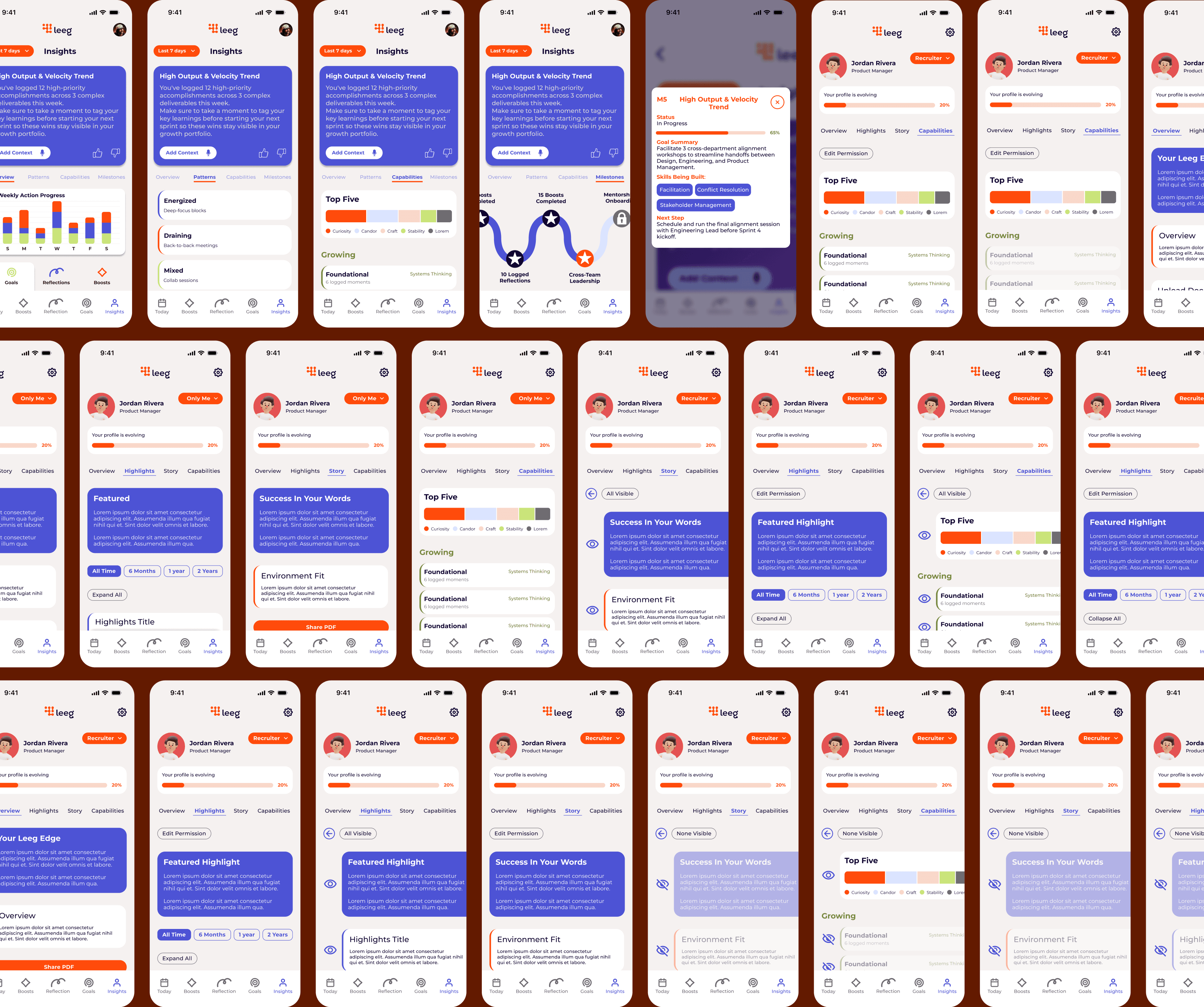
Public vs. Private Views
Designed a clear toggle between a polished recruiter-facing profile and a private growth space.
Role-Tailored Evidence
Replaced generic text tags with flexible proof blocks (work samples, hard numbers, and certifications).
INSIGHT
MILESTONES
MILESTONE
Single Focal Story Card
Replaced static metric grids with one high-priority weekly insight to reduce cognitive fatigue.
Microhabit Mechanics
Introduced bite-sized progress nodes and dopamine-driven completion triggers to build a daily returning loop.
Unified Metrics Engine
Synced decay counters and skill scores directly with the Home screen to maintain data consistency and trust.
CAREER PROFILE
CAPABILITIES
Public vs. Private Views
Designed a clear toggle between a polished recruiter-facing profile and a private growth space.
Role-Tailored Evidence
Replaced generic text tags with flexible proof blocks (work samples, hard numbers, and certifications).
USABILITY TESTING
3 Participants: 2 active Leeg users, 1 non-users.
VISUAL & STRUCTURAL POLISH
Participants agreed the redesigned screens were visually sleek, modern, and intuitive to navigate.
THE CORE ISSUE (UNSOLVED FATIGUE & BURDEN)
Users felt these new screens did not solve the fundamental problems of the app—specifically information overload, feature bloat, and the "homework" burden that prevents them from returning.
Because stakeholders mandated adding new screens instead of stripping back existing features, the core fatigue issue remained largely unaddressed.
FINAL REFLECTIONS
The Balancing Act
This project highlighted the delicate balance between satisfying business mandates and advocating for user needs.
While we successfully delivered polished, structured new features (Insights and Career Profile), user testing proved that adding features alone cannot fix fundamental cognitive overload.
Key Takeaway
Real engagement doesn't come from more screens—it comes from stripping away friction.
For Leeg to truly shift from feeling like "homework" to becoming a daily habit, the next iteration must focus on aggressive feature consolidation, automated data entry (CV import), and a simplified core loop.
